High-impact dashboards
Interactive visualizations that combine technique, executive design and decision focus.
Sales & Analytics Dashboard
Example dashboard built in Power BI focused on sales analysis, strategic KPIs and data-driven decision making.
Executive Analysis
Tracking revenue, sales volume, average ticket, regional performance and product behavior throughout the analyzed period.
The dashboard presents a complete executive view of commercial operations, enabling tracking of revenue, sales volume, average ticket, regional performance, sales channels and product behavior throughout the analyzed period.
In the presented scenario, the company achieved total revenue exceeding R$ 100 million, distributed across more than 100 thousand sales throughout 2024, maintaining an average ticket close to R$ 1 thousand per order. These indicators demonstrate an operation with high transactional volume and good revenue generation capacity.
The temporal analysis shows stability in sales throughout the year, with emphasis on the months of July and December, which presented the highest revenues of the period. This behavior may indicate commercial seasonality, promotional campaigns or increased demand in specific periods, allowing future marketing and inventory strategies to be directed.
In the channel breakdown, a fairly balanced distribution is observed between Marketplace, E-commerce and Physical Store, showing a mature omnichannel operation without strong dependence on a single sales channel. This balance reduces operational risks and expands possibilities for sustainable growth.
The subcategory analysis reveals a diversified product portfolio, without excessive concentration on just one item. Products such as Sneakers, Vacuum Cleaner, T-shirt and Dumbbell appear among the highest revenues, indicating opportunities in both sports segments and home appliances and fashion.
Regionally, states such as Bahia, Pernambuco, Rio de Janeiro and Minas Gerais appear among the highest revenues, allowing the identification of strategic regions for commercial expansion, regional campaigns and logistics optimization.
The store ranking also allows identifying units with greater operational efficiency, considering revenue, quantity sold and average ticket. Some stores present an average ticket above the general average, demonstrating potential for actions aimed at higher value-added products.
Data Model Structure
Well-defined Star Schema with a centralized fact table and specialized dimensions for maximum query performance and analytical clarity.
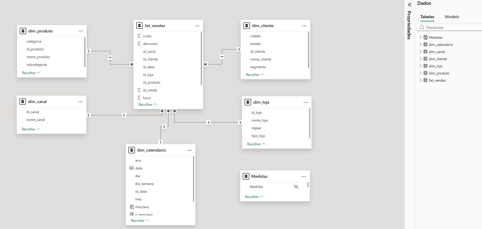
Model Structure
Central Fact Table
fat_vendas — records all sales transactions with keys for each dimension and quantitative measures.
dim_cliente
Customer segmentation and location
dim_produto
Category, mix and product characteristics
dim_loja
Region, type and store performance
dim_canal
Sales origin and channel
dim_calendario
Temporal intelligence and seasonality
DAX Measures
Dedicated measures table for standardization and easier maintenance of the model.
Modeling Highlights
Well-Defined Star Schema
Centralized fact table with dimensions in 1:N relationships, improving query performance, analytical clarity and future scalability.
Correct Dimension Separation
Each dimension has a specific role, enabling analysis by region, category, channel, period and customer segment.
Dedicated Calendar
dim_calendario enables Time Intelligence, running totals, YoY comparisons, MTD/YTD and seasonality analysis.
Professional Measure Organization
A dedicated DAX measures table shows maturity: better maintenance, clean navigation, standardization and ease for other analysts.
Upcoming projects
More cases in the works, covering the main business areas.
Finance Dashboard
P&L, cash flow, payables/receivables and profitability indicators.
Operational Analytics
Operational efficiency, SLA, productivity and resource management.
Executive Indicators
C-level dashboard with OKRs, goals and strategic alerts.
Customer Analytics
Behavior, churn, LTV and advanced customer segmentation.